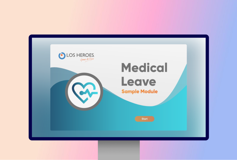
Medical Leave

Medical Leave Process Transformation: From Flash to HTML5
When I first encountered the medical leave course, it was a legacy Flash-based training that was not only outdated technologically but also visually cluttered and text-heavy. The content was crucial for employees because understanding medical leave processes directly impacts people's well-being, but the presentation was holding back effective learning. I saw an opportunity to completely reimagine this important resource through modern web technologies and thoughtful instructional design.
The Problem
The existing medical leave course faced several critical issues:
- It was built in Flash, which was being phased out by browsers and unsupported on mobile devices
- The interface was visually dated and inconsistent with current design standards
- Content was unnecessarily complex and text-heavy, making key information difficult to absorb
- The learning experience lacked engaging interactive elements that could help explain complex processes
- Visual workflows were absent, forcing learners to mentally construct process steps from paragraphs of text
These limitations weren't just aesthetic concerns. They created genuine barriers to understanding important information about medical leave processes that employees needed to navigate during potentially stressful periods in their lives.
Initial Exploration/Research
Before jumping into design, I needed to understand both the content needs and the visual direction:
First, I partnered with the subject matter expert (SME) to understand which content elements were essential and which could be simplified or removed. Together, we identified opportunities to restructure complex information into more digestible chunks.
For visual inspiration, I explored contemporary UI design on platforms like Dribbble, looking specifically for interfaces that balanced clarity with visual interest. I was drawn to designs that used animation purposefully, not just for decoration, but to guide attention and reveal information progressively.
I also researched how other successful eLearning experiences were handling process-based content. I noticed that the most effective examples transformed complex procedures into visual workflows where users could see relationships between steps rather than just reading about them sequentially.
This exploration phase confirmed my instinct that the project needed both a visual overhaul and a fundamental rethinking of how the content was structured and presented.
Process
My approach centered around designing and developing simultaneously, with regular feedback loops:
- Content restructuring: Working closely with the SME, we rewrote and reorganized the content to be more concise and action-oriented. We prioritized information based on what employees would most need to know and removed unnecessary details that were clouding the core message.
- Visual asset creation: I designed all visual elements from scratch in Affinity Designer, creating a consistent visual language that would unify the experience. I focused on developing clean, modern UI components and illustrations that would complement rather than compete with the content.
- Workflow visualization: One of my key innovations was transforming text-heavy process descriptions into visual workflow diagrams. For complex procedures like requesting extended leave or submitting medical documentation, I created step-by-step visual guides that made the relationships between actions immediately apparent.
- Interactive development: I used Tumult Hype to bring these assets to life, creating smooth transitions and thoughtful interactions. I wasn't interested in animation for its own sake. Each movement had a purpose, whether revealing additional information, emphasizing relationships, or guiding the learner's attention to key elements.
- Custom coding: For more complex interactions, I implemented JavaScript to create custom behaviors like modal popups for supplementary information and sequential reveals for step-by-step processes. These interactions were designed to unfold at a deliberate pace that felt natural without being distracting.
Throughout this process, I maintained a balance between visual appeal and learning effectiveness. Every design decision was evaluated against the question: "Does this help employees better understand the medical leave process?"
Challenges
The project wasn't without its difficulties:
- Technical constraints: Moving from Flash to HTML5 meant rethinking interactions within the capabilities of web standards. Some effects that were simple in Flash required creative approaches in HTML5 and JavaScript.
- Content complexity: Medical leave processes contain numerous exceptions and special cases. Finding ways to present these without overwhelming learners required multiple iterations and careful information architecture.
- Balancing visual interest with clarity: I wanted the course to be visually engaging but not at the expense of comprehension. This meant repeatedly adjusting animation timing, interaction patterns, and visual hierarchy to find the right balance.
- Cross-platform consistency: Ensuring the experience worked well across devices required testing and adjustments to make sure interactions remained intuitive whether on desktop or mobile.
With each challenge, I returned to my core objective: creating a learning experience that would help employees navigate medical leave processes with confidence and clarity.
Results
- Enhanced accessibility: By moving to HTML5, the course became available on all modern devices and platforms, expanding its reach to employees regardless of where they accessed it.
- Improved comprehension: The visual workflows made complex processes easier to understand, with feedback suggesting employees felt more confident navigating medical leave procedures after completing the updated course.
- Reduced cognitive load: By streamlining content and using progressive disclosure through interactive elements, learners could focus on understanding one concept before moving to the next.
- Modern visual appeal: The refreshed design aligned with contemporary standards, giving the course a professional, current feel that reflected the importance of its content.
- More engaging experience: Thoughtful animations and interactions maintained learner interest without becoming distractions, helping to sustain attention through important but potentially dry material.
What I found most satisfying about this project was the opportunity to apply both technical skills and instructional design principles to create something genuinely useful. By transforming how this information was presented, I helped make an important process more accessible and understandable, potentially making a difference during what can be a stressful time for employees.
This project reinforced my belief that good design in learning experiences isn't just about aesthetics. It's about removing barriers between people and the information they need.