Financial Education: A short course for end users
Financial Education: Accessible Financial Learning for Los Héroes Affiliates
The Problem
Financial literacy is a critical life skill, yet many people lack basic knowledge about personal finance management. Los Héroes, a financial institution, recognized this gap among their affiliates and sought to address it through accessible education. The challenge was clear: how might we create a financial education course that would be approachable, easy to understand, and engaging for users with varying levels of financial knowledge?
Many existing financial education resources suffer from common problems:
- They use complex terminology that alienates beginners
- They present too much information at once, overwhelming learners
- They lack visual aids that help clarify concepts
- They fail to connect abstract financial concepts to everyday decisions
The goal was to develop a course that would overcome these barriers, making financial education accessible and actionable for Los Héroes' affiliates.
Initial Exploration/Research
Before diving into design, I needed to understand the target audience and their specific needs. Through conversations with the Los Héroes team, we identified key characteristics of their affiliates:
- Wide range of ages and educational backgrounds
- Limited previous exposure to formal financial education
- Need for practical, immediately applicable financial knowledge
- Preference for visual learning over text-heavy content
I also reviewed existing financial education materials to identify what worked well and what didn't. Many resources fell into one of two categories: either too simplistic to be useful, or too complex to be accessible. The sweet spot would be clear, concise content that respects the intelligence of learners while making concepts approachable.
Process
With research insights in hand, I began crafting the course structure and visual approach. The process unfolded in several key phases:
Content Simplification
Financial concepts can be intimidating, so I worked closely with content experts to distill complex ideas into their essential elements. For each topic, we asked: "What's the core concept someone needs to understand?" and "How does this apply to everyday life?" This helped ensure the content would be both accessible and practical.
Visual Design System
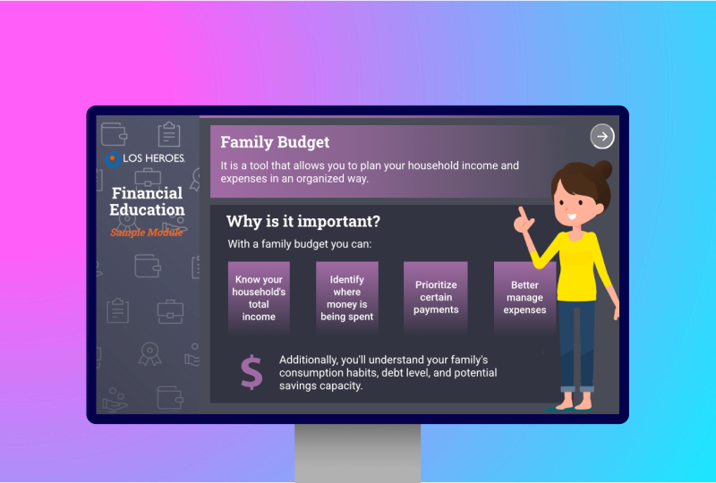
I created a visual system that would support learning while maintaining visual interest. Key elements included:
- Flat design with minimal visual distractions
- Distinct color coding for each topic to aid navigation and recall
- Consistent typography hierarchy to organize information
- Simple illustrations that support rather than distract from the content
Information Architecture
To prevent cognitive overload, I organized content into digestible chunks with a clear progression. Each screen focused on a single concept or question, building knowledge incrementally. This "micro-learning" approach helps learners absorb information without feeling overwhelmed.
Challenges
Creating this course came with several challenges that required creative problem-solving:
Balancing Simplicity and Depth
The biggest challenge was finding the right balance between making content accessible and ensuring it provided genuine value. Too simple, and users wouldn't learn anything meaningful; too complex, and they might disengage.
Visual Consistency with Limited Resources
Working within technical constraints meant being selective about visual elements. I needed to create visual interest while keeping file sizes small and loading times quick.
Results
- User-Friendly Learning Experience: The course provided a clean, intuitive interface that allowed users to focus on content without being distracted by complex navigation or visual clutter.
- Practical Financial Knowledge: By focusing on actionable concepts like budgeting, saving, and avoiding debt, the course gave users tools they could immediately apply to their financial lives.
- Visual Communication: The color-coded topics and consistent visual language helped reinforce learning and make navigation intuitive.
This project demonstrated how thoughtful instructional design and UI can make complex topics accessible to diverse audiences. By prioritizing clarity, relevance, and user-centered design, we created a learning experience that empowered users with essential financial knowledge in an engaging format.