Getting Started with AI: An Interactive Course for Corporate Employees
The Problem
When tasked with creating an AI course for corporate employees, I identified key gaps in traditional eLearning. Most courses rely on rigid "next button" navigation that restricts learner autonomy and fails to accommodate diverse learning paces. Additionally, AI topics are typically presented in overly technical ways that alienate non-technical staff.
Corporate learners need AI concepts presented in accessible frameworks they can immediately apply. Many aren't aware they already have AI tools within their existing software, particularly in Microsoft Office applications.
I aimed to create a course that would:
- Break away from linear navigation
- Present complex AI concepts in approachable ways
- Bridge the gap between theory and practical application
- Help employees discover AI tools already at their disposal
Initial Exploration/Research
My research focused on interaction patterns, visual design approaches, and content strategy for AI education.
For interactions, I explored alternatives to standard navigation systems. After investigating JavaScript interactions, I discovered mouse wheel events could create a more engaging experience where content reveals as users scroll, creating a sense of discovery.
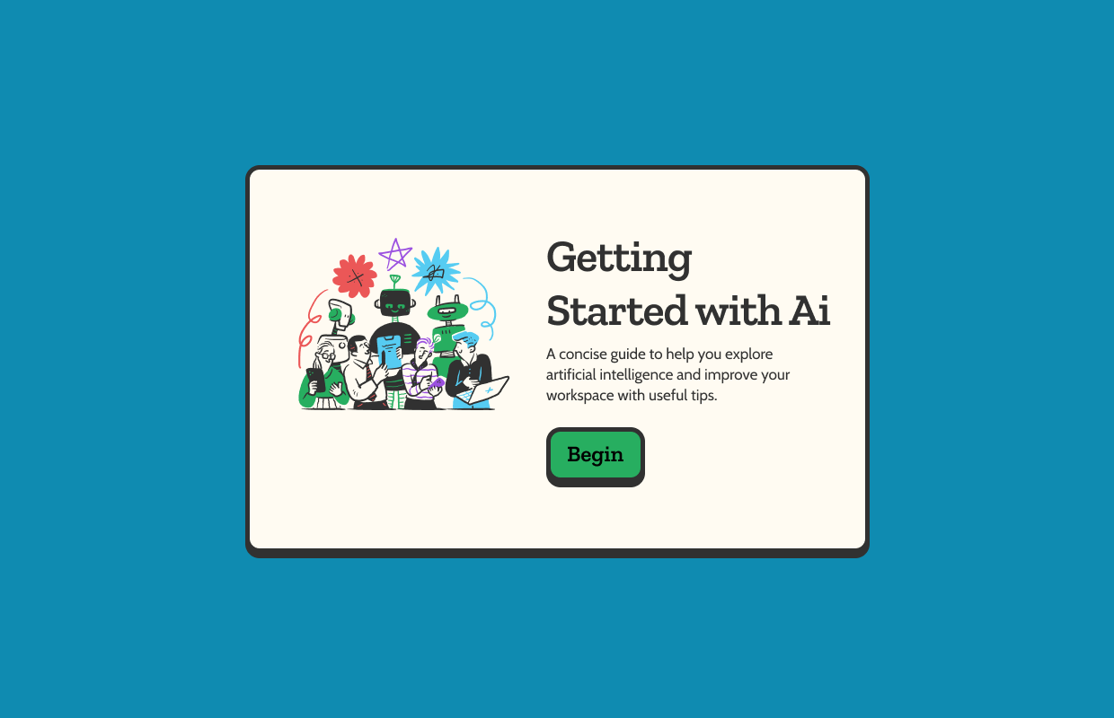
For visual design, I studied minimalist interfaces through Dribbble and Figma templates. I was drawn to clean layouts with ample white space complemented by hand-drawn illustrations that made technical subjects feel approachable.
For content, I found most corporate AI training either oversimplified concepts or overwhelmed employees with jargon. I needed to find a sweet spot where content was simple enough to understand but detailed enough to be meaningful.
Process
I began by outlining core content modules including basic AI concepts, terminology, practical applications, and available tools within existing software.
Next, I developed a scroll-based interaction where new content appears as users scroll down. This allows learners to control their pace, revisit previous concepts easily, and experience a sense of discovery.
For the visual design, I created a minimal aesthetic with:
- Clean typography with clear hierarchy
- Generous white space to prevent cognitive overload
- Hand-drawn illustrations for a friendly, approachable tone
- Strategic color use to highlight key concepts
- Visual metaphors to explain abstract ideas
I structured information in digestible chunks using metaphors and real-world comparisons. For example, I compared AI to "having a skilled assistant that learns from examples, improves with practice, and works under your supervision."
I organized content into logical sections from basic concepts to practical applications and recommended tools.
Challenges
Creating a smooth scrolling experience required careful JavaScript programming, balancing innovation with cross-browser compatibility and accessibility.
Simplifying complex AI concepts without losing crucial nuance took multiple iterations. I struggled with questions like: How do I explain machine learning versus deep learning in an accessible but accurate way?
Visual consistency was challenging when integrating hand-drawn illustrations with a minimal interface. Finding the right balance took several design iterations.
Without structured pacing of traditional eLearning, I needed to ensure learners wouldn't skip important concepts. I addressed this with visual cues and animation timing to guide attention before revealing new content.
Results
Feedback highlighted that learners appreciated controlling their own pace, found the scrolling interaction more natural than traditional navigation, and that the combination of hand-drawn illustrations with minimal design made technical concepts more approachable.
The section on writing effective prompts proved especially valuable, with users reporting immediate improvements in their AI interactions. Many were surprised to discover AI capabilities already present in their familiar software.
From a design perspective, this project demonstrated how thoughtful interaction design can transform learning experiences. By giving users agency over their journey and presenting information in a visually appealing, digestible format, the course achieved its goal of making AI accessible to corporate audiences.